CAPTURING THEIR KILLER:
THE GIRLS ON THE HIGH BRIDGE
HULU / DISNEY
In this Hulu original true crime documentary, I was the creative director, art director, designer and animator for most of the graphics and effects work across the series.
TEXT PACKAGE
The core concept for the series-wide text package was based solely on having two spaces between every word - representing one space for each of the two slain girls.


This double spaced motif carried over to Title Cards and Supers 👇


The double spacing motif even shows up in the informational text slates 👇

Double spacing between names and identifier captions in the lower 3rd IDs 👇


PHOTO CAROUSELS
From victim photos to state’s evidence, all photographs got placed in some kind of “viewer” environment. The idea was to present the images as if they had already been organized and curated by police.
Faux filenames were added at the bottom of the photos to serve a double purpose. One, to subtly identify the subjects. And two, to sell the idea that we are viewing these images in some kind of database. 👉


ADDING AUTHENTIC DETAILS
Aging and degrading VHS footage can come off as inauthentic if it’s too heavy-handed. Subtlety is key when treating things like this, especially if they are from the not too distant past. It can’t look too clean, nor too dirty. It should have a feeling as if it’s been played many times but not destroyed. Just lightly used and aged.
These moments were a good opportunity to visually elevate the footage without making the texture the star of the show.


MAPS
A photographic style was chosen for the maps because it was important to present the location of the crime in a way that’s most true to the real thing. It was also important for the trees to be in the same time of year as when the murders occurred.
This styling really helps us to understand the location, timeline and story better than a graphic presentation of the area.


DOCUMENTS
Almost all of the documents seen in this show were re-made from scratch in order to enhance quality. As with most forensic materials, documents are provided in all kinds of shapes and sizes and quality is usually compromised as a result. Re-making them keeps the aesthetics even and consistent (and legible!) throughout the show.


CRIME SCENE DIAGRAM
The original police diagram of the crime scene was not very clear, nor photogenic for television. So I interpreted the original drawing and made my own diagram from scratch.
I placed it in a clunky viewing window because custom forensics software typically has an interface that harkens to late 90’s / early 00’s Microsoft applications.


BRIDGE GUY VIDEO ANALYSIS
All previous television versions of this story include the famous “Bridge Guy” video. Surprisingly, none of them took the liberty to smooth this video out so it could really be understood and examined by a home audience. The original version is handheld, in vertical orientation, and was recorded sideways. It is also pretty shaky footage. But that doesn’t mean it should be presented this way.
To solve this, I made a super duper slow motion version of the small section of video where “bridge guy” can be fully seen. The in-between frames were smoothed out as much as technology would allow. A bit of granular time-reshaping made it even smoother. Then I blew up the video so it filled the entire screen. A camera was added to “float” around the space, smoothing out the shakiness even more.
This important evidence was worth the extra care.
SEE IT IN ACTION 👉
SOCIAL MEDIA
All social media posts were re-made from scratch so that the quality could be enhanced. Pictures and other decorations were lifted from the low quality originals and sharpened but everything else was replicated and replaced as part of the graphics work on this show.
Including these Facebook montages.

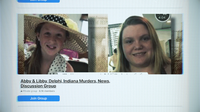

And these replicated Facebook posts, pictures and polls, all basically re-made from scratch.


Even these isolated Snapchat messages were re-made from scratch.


Also this YouTube environment was entirely made from scratch to house the YouTube videos of online sleuths.


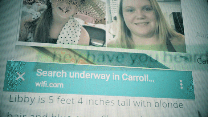
NEWS MATERIALS
Since this crime took place in 2017, much of the news material that covers the case is in digital format. But some were printed newspaper articles so I decided to treat those as if they were still being viewed on a computer screen. That made news materials aesthetically consistent across the board.


MUGSHOTS
No mugshot is ever perfect. There’s a lot of random variation from state to state, county to county, and therefore mugshot to mugshot. So it’s important that images like this are refurbished as a group with consistency in mind.
Mugshots usually have to be repaired, reshaped, reframed (cropped) and recolored. All of these mugshots went through a full clean up with background extensions. That means I added in wall texture where it didn’t previously exist in order to get the subject’s face perfectly centered. On some occassions I had to paint in some shoulders.


